Show the code
library(tidyverse)
library(BayesERtools)
library(posterior)
library(ggdist)
library(bayesplot)
library(here)
library(gt)

theme_set(theme_bw(base_size = 12))This page showcase the model simulation using the ER model for binary endpoint.
library(tidyverse)
library(BayesERtools)
library(posterior)
library(ggdist)
library(bayesplot)
library(here)
library(gt)
theme_set(theme_bw(base_size = 12))data(d_sim_binom_cov)
d_sim_binom_cov_2 <-
d_sim_binom_cov |>
mutate(
AUCss_1000 = AUCss / 1000, BAGE_10 = BAGE / 10,
BWT_10 = BWT / 10, BHBA1C_5 = BHBA1C / 5
)
# Grade 2+ hypoglycemia
df_er_ae_hgly2 <- d_sim_binom_cov_2 |> filter(AETYPE == "hgly2")
var_resp <- "AEFLAG"
var_exposure <- "AUCss_1000"set.seed(1234)
ermod_bin_hgly2 <- dev_ermod_bin(
data = df_er_ae_hgly2,
var_resp = var_resp,
var_exposure = var_exposure
)
ermod_bin_hgly2
── Binary ER model ─────────────────────────────────────────────────────────────
ℹ Use `plot_er()` to visualize ER curve

── Developed model ──

stan_glm
 family:       binomial [logit]
 formula:      AEFLAG ~ AUCss_1000
 observations: 500
 predictors:   2
------
            Median MAD_SD
(Intercept) -2.04   0.23
AUCss_1000   0.41   0.08
------
* For help interpreting the printed output see ?print.stanreg
* For info on the priors used see ?prior_summary.stanreg
new_conc_vec <- c(1, 3, 9)

# Sim at specific conc
d_sim_new_conc <-
  sim_er_new_exp(ermod_bin_hgly2,
    exposure_to_sim_vec  = new_conc_vec,
    output_type = c("median_qi"))

d_sim_new_conc |>
  select(-starts_with(".linpred"), -c(.row, .width, .point, .interval)) |>
  gt() |>
  fmt_number(decimals = 2) |>
  tab_header(
    title = md("Predicted probability of events at specific concentrations")
)| Predicted probability of events at specific concentrations | |||
| AUCss_1000 | .epred | .epred.lower | .epred.upper |
|---|---|---|---|
| 1.00 | 0.16 | 0.12 | 0.21 |
| 3.00 | 0.31 | 0.27 | 0.35 |
| 9.00 | 0.84 | 0.67 | 0.93 |
# Sim to draw ER curve
d_sim_curve <-
  sim_er_curve(ermod_bin_hgly2, output_type = c("median_qi"))

d_sim_curve |>
  ggplot(aes(x = AUCss_1000, y = .epred)) +
  # Emax model curve
  geom_ribbon(aes(y = .epred, ymin = .epred.lower, ymax = .epred.upper),
    alpha = 0.3, fill = "deepskyblue") +
  geom_line(aes(y = .epred), color = "deepskyblue") +
  # Prediction at the specified doses
  geom_point(
    data = d_sim_new_conc,
    aes(y = .epred), color = "tomato", size = 3
  ) +
  geom_errorbar(
    data = d_sim_new_conc,
    aes(y = .epred, ymin = .epred.lower, ymax = .epred.upper),
    width = 0.03, color = "tomato"
  ) +
  ggplot2::coord_transform(x = "log10", ylim = c(0, 1)) +
  scale_y_continuous(
    breaks = c(0, .5, 1),
    labels = scales::percent
  ) +
  ggplot2::scale_x_continuous(
    breaks = xgxr::xgx_breaks_log10,
    minor_breaks = xgxr::xgx_minor_breaks_log10
  ) +
  labs(
    x = "AUC~ss~ / 1000", y = "Probability of event",
    title = "ER model predictions at new exposure levels",
    caption = "Area: 95% credible interval"
  ) +
  theme(axis.title.x = ggtext::element_markdown())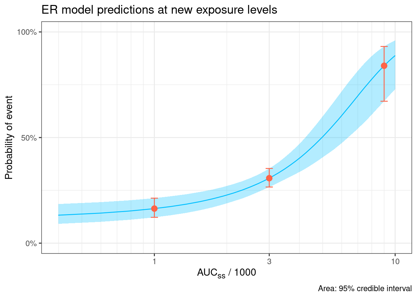
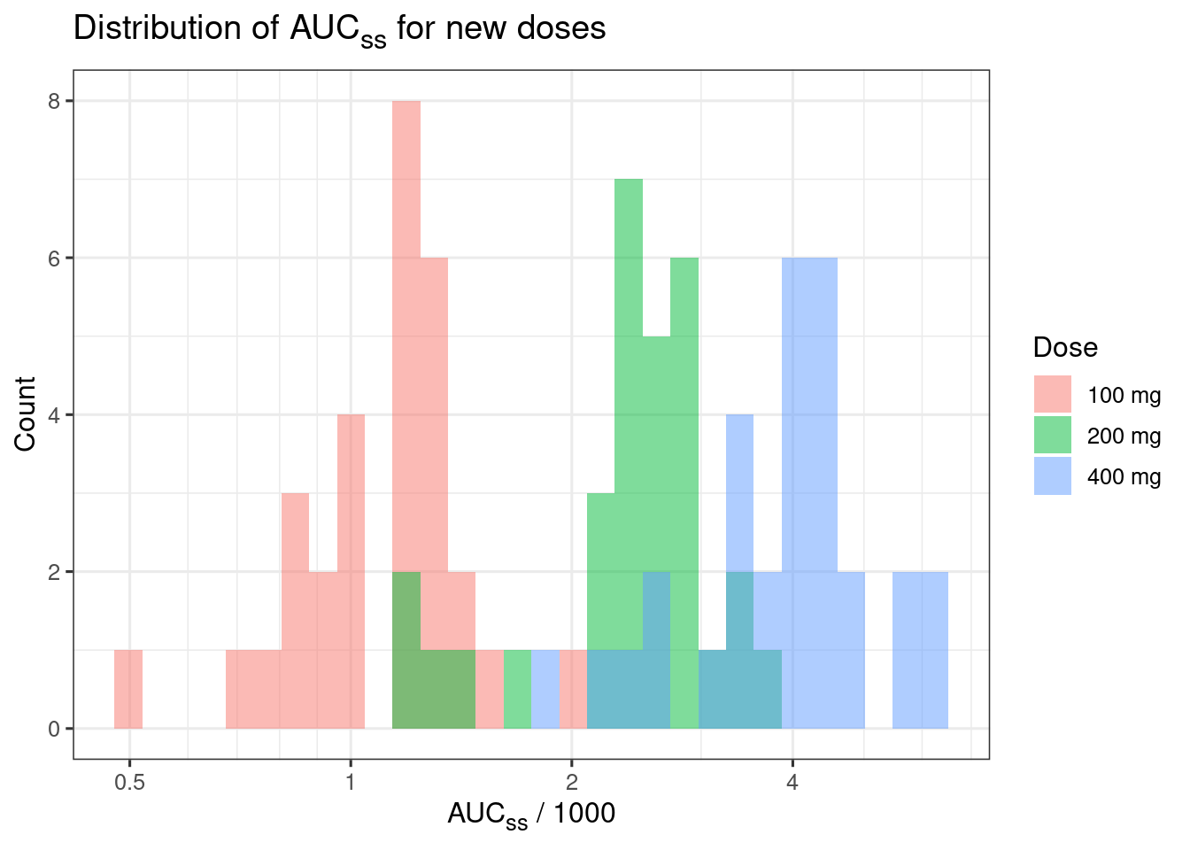
set.seed(1234)

d_new_dose_pk <-
  tibble(Dose_mg = rep(c(100, 200, 400), each = 30)) |>
  mutate(CL = rlnorm(n(), meanlog = log(100), sdlog = 0.3),
    AUCss_1000 = Dose_mg / CL,
    Dose = glue::glue("{Dose_mg} mg"))

d_median_auc <-
  d_new_dose_pk |>
  group_by(Dose) |>
  summarize(AUCss_1000 = median(AUCss_1000))

ggplot(d_new_dose_pk, aes(x = AUCss_1000, fill = Dose)) +
  geom_histogram(position = "identity", alpha = 0.5) +
  labs(
    x = "AUC~ss~ / 1000", y = "Count",
    title = "Distribution of AUC~ss~ for new doses"
  ) +
  theme(plot.title = ggtext::element_markdown(),
    axis.title.x = ggtext::element_markdown()) +
  ggplot2::coord_transform(x = "log10") +
  ggplot2::scale_x_continuous(
    breaks = xgxr::xgx_breaks_log10,
    minor_breaks = xgxr::xgx_minor_breaks_log10
  )
`stat_bin()` using `bins = 30`. Pick better value `binwidth`.
d_sim_new_dose_raw <-
  sim_er(ermod_bin_hgly2,
    newdata = d_new_dose_pk)

d_sim_new_dose_per_dose <-
  d_sim_new_dose_raw |>
  # Calc per-dose summary probability for each MCMC draws
  ungroup() |>
  summarize(prob = mean(.epred), .by = c(Dose, Dose_mg, .draw)) |>
  # Summarize across MCMC draws
  group_by(Dose, Dose_mg) |>
  median_qi() |>
  ungroup() |>
  # Add median AUCss
  left_join(d_median_auc, by = "Dose")


d_sim_curve |>
  ggplot(aes(x = AUCss_1000, y = .epred)) +
  # Emax model curve
  geom_ribbon(aes(y = .epred, ymin = .epred.lower, ymax = .epred.upper),
    alpha = 0.3, fill = "grey") +
  geom_line(aes(y = .epred), color = "grey") +
  # Prediction at the specified doses
  geom_point(
    data = d_sim_new_dose_per_dose,
    aes(y = prob, color = Dose), size = 3
  ) +
  geom_errorbar(
    data = d_sim_new_dose_per_dose,
    aes(y = prob, ymin = .lower, ymax = .upper, color = Dose),
    width = 0.03
  ) +
  geom_boxplot(
    data = d_new_dose_pk,
    aes(x = AUCss_1000, y = -0.1, fill = Dose, color = Dose),
    width = 0.1, alpha = 0.5, inherit.aes = FALSE
  ) +
  geom_hline(yintercept = 0, linetype = "solid", linewidth = 0.2) +
  ggplot2::coord_transform(x = "log10", ylim = c(-0.15, 1)) +
  scale_y_continuous(
    breaks = c(0, .5, 1),
    labels = scales::percent
  ) +
  ggplot2::scale_x_continuous(
    breaks = xgxr::xgx_breaks_log10,
    minor_breaks = xgxr::xgx_minor_breaks_log10
  ) +
  labs(
    x = "AUC~ss~ / 1000", y = "Probability of event",
    title = "ER model predictions at new dose levels",
    caption = "Area: 95% credible interval
    Boxplot: Observed exposure levels
    Symbols: Predicted mean probability for each dose and 95% CI"
  ) +
  guides(
    fill = guide_legend(reverse = TRUE),
    color = guide_legend(reverse = TRUE)
  ) +
  theme(axis.title.x = ggtext::element_markdown())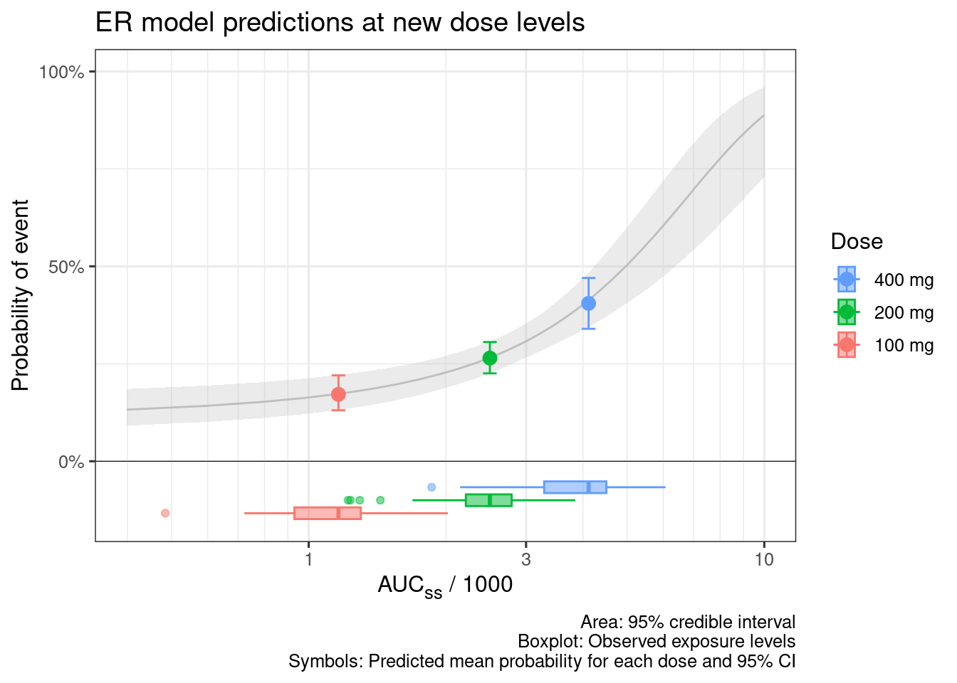
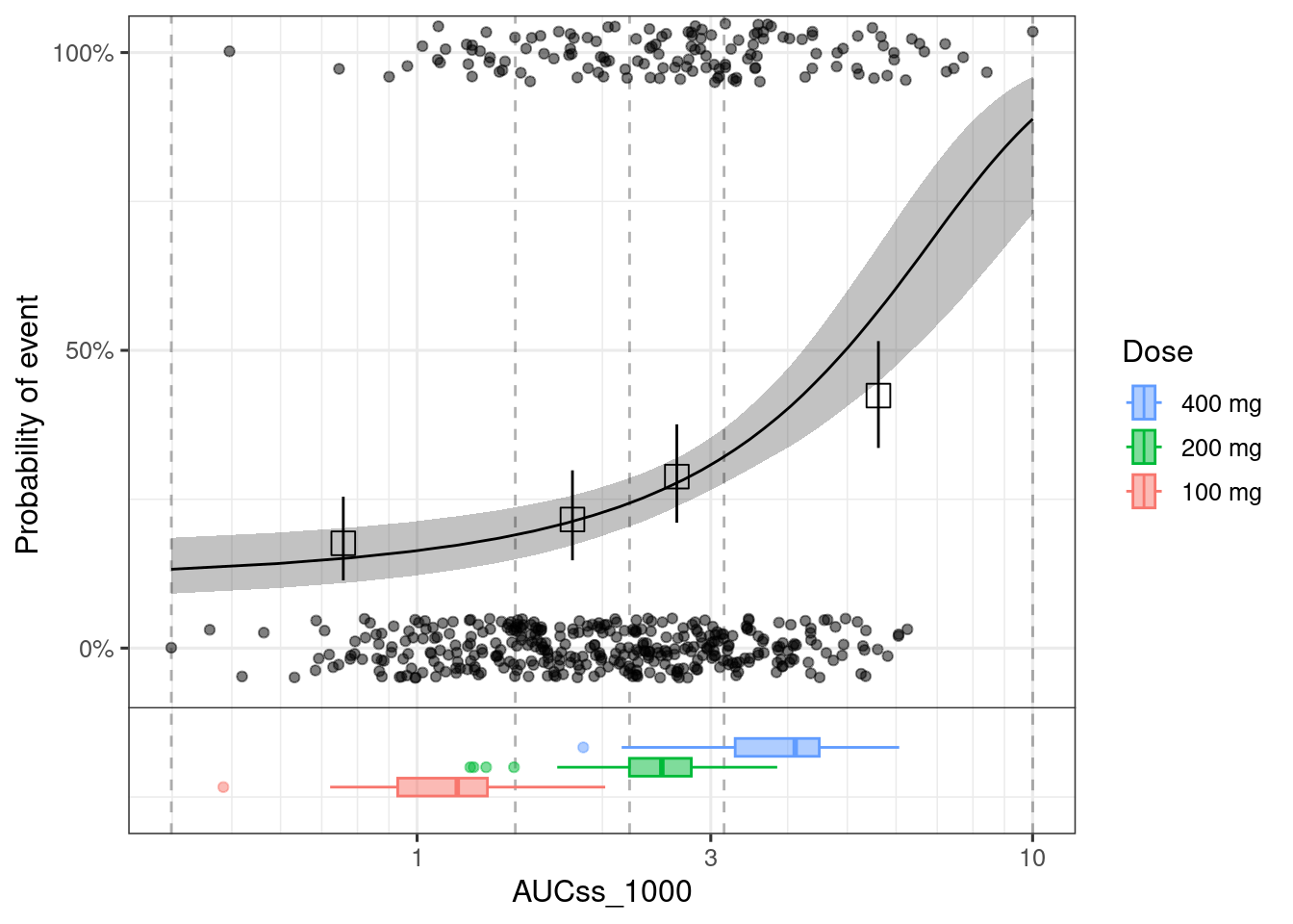
When you use plot_er_gof() function, you can only add boxplot for the data that you used for the model fit.
See below the example of adding exposure boxplot to any ER plot.
plot_er(ermod_bin_hgly2, show_orig_data = TRUE) +
  geom_boxplot(
    data = d_new_dose_pk,
    aes(x = AUCss_1000, y = -0.2, fill = Dose, color = Dose),
    width = 0.1, alpha = 0.5, inherit.aes = FALSE
  ) +
  geom_hline(yintercept = -0.1, linetype = "solid", linewidth = 0.2) +
  ggplot2::coord_transform(x = "log10", ylim = c(-0.25, 1)) +
  ggplot2::scale_x_continuous(
    breaks = xgxr::xgx_breaks_log10,
    minor_breaks = xgxr::xgx_minor_breaks_log10
  ) +
  guides(
    fill = guide_legend(reverse = TRUE),
    color = guide_legend(reverse = TRUE)
  )